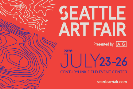
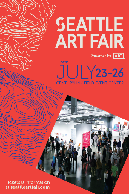
Seattle Art Fair 2020 // I was able to work closely with Seattle Art Fair’s Director and Vulcan Arts +Entertainment’s Marketing Director on a new look and “brand wash” for the 2020 fair. We agreed that moving forward, each year needed to feel different in some way entice patron return and ticket purchase year-over-year.
This year it was decided that the fair should go bold with the color pallete and use the brand’s red as the primary color, instead of the traditionally used blue. Additionally, since the fair aims to promote Pacific Northwest artists and galleries, we gave a subtle nod in our marketing tools. Carefully selected abstract slices of Mount Rainier topography were utilized.
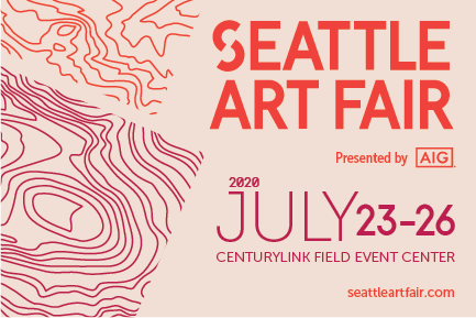
A second, lighter color palette was used for ‘select’ VIP members to set them apart during the fair, and for specific marketing programs and credentials directed toward those VIP members.


